BaxiPay
Baxipay is an iOS, Android & web-based application that helps making bills and services payments easily accessible to users. By providing users with a platform to make payments and manage expenses via their mobile phones and the web.
Deliverables
- User Research
- User Experience Design
- Visual Design
- Usability Testing
Project Details
- Mobile Payments
- Duration : 3 months
- Platform : iOS and Andriod
- Client : Capricon Digital
Tools Used
- Sketch and Figma
- Miro
- Notion
- Google Forms
- Maze
- Confluence

Project Overview
Baxipay was initially developed by Capricon digital for users to buy/sell different types of digital products and services. Baxipay offers a wide range of services users can pay for, bills, services, transfer money, and as well request payment. Capricon digital reached out to me with the first version of their product (Baxipay). They've had it in the market for a while. They wanted to design some new features for the app but weren't sure what to. I was tasked to lead end-to-end design through research, wire-framing, interaction design, visual design, prototyping, and cross-team collaboration. I worked closely with the Product Manager to identify user needs.
Problem Statement
The Baxipay mobile app started to experience a failure in retention. The product users had already started porting to other direct and indirect competitors like gomoney, Kuda, Paga e.t.c
The Goal & Objective
We had a lengthy conversation around the needs of the customers in lines with the goals of the brand to create interactions that are beneficial and meaningful to both the company and the users.
User Goals
- Instant payments between wallets
- Instant payments to and from bank accounts
- Bills payment
- Easy and fast self registration
- Rewards
- Budgeting & Planning
- Security
Business Goals
- Increase users retention & acquisition
- Establish trust and credibility through excellent service
- Differentiate from competitors through innovation.
Design Goals
- Understand user needs through comprehensive user research
- Clearly communicate users task and actions
- Delight users with modern aesthetics.
UX Challenges & Constraints
While working on this project I was faced with a few challenges and constraints which I’d list out. All within the functional, non-functional and commercial constraints.
- The client's budget didn’t match my expectation. Negotiations went on for about a week.
- The scope of the project was initially just a mobile app. The client later requested a web app on completion of the mobile designs.
- Body copy for the application was a challenge as well. The client didn’t have a UX writer and there was no budget for that. I am currently mastering micro-copy though.
- Also had time constraints. The web app was to be delivered within the time frame for the mobile app.
- We needed custom icons and couldn’t get an icon pack that fits everywhere. So I had to design/customize in Figma
- I had to onboard the developers on Figma as they weren’t familiar with it. It slowed down development initially
- Primary research, secondary research, and design iterations were quite a herculean task
- At some point, I became too focused on UI and not the UX but later retraced my footsteps.
- Stakeholders at some point had a conflicting preference.
Key Metrics
Upon completion of this project. We decided to test with some users to get some useful feedback. We found the following while testing Users were very satisfied with the user interface. Users were definitely going to recommend to a friend or colleague. Average task completion time reduced by 20%. Users loved the new features.
Solution
After primary and secondary research was done, the solution was to redesign a new app. A total overhaul of the old app as well as adding new featuresFor a more in-depth look at my process, continue scrolling to see the full case study.
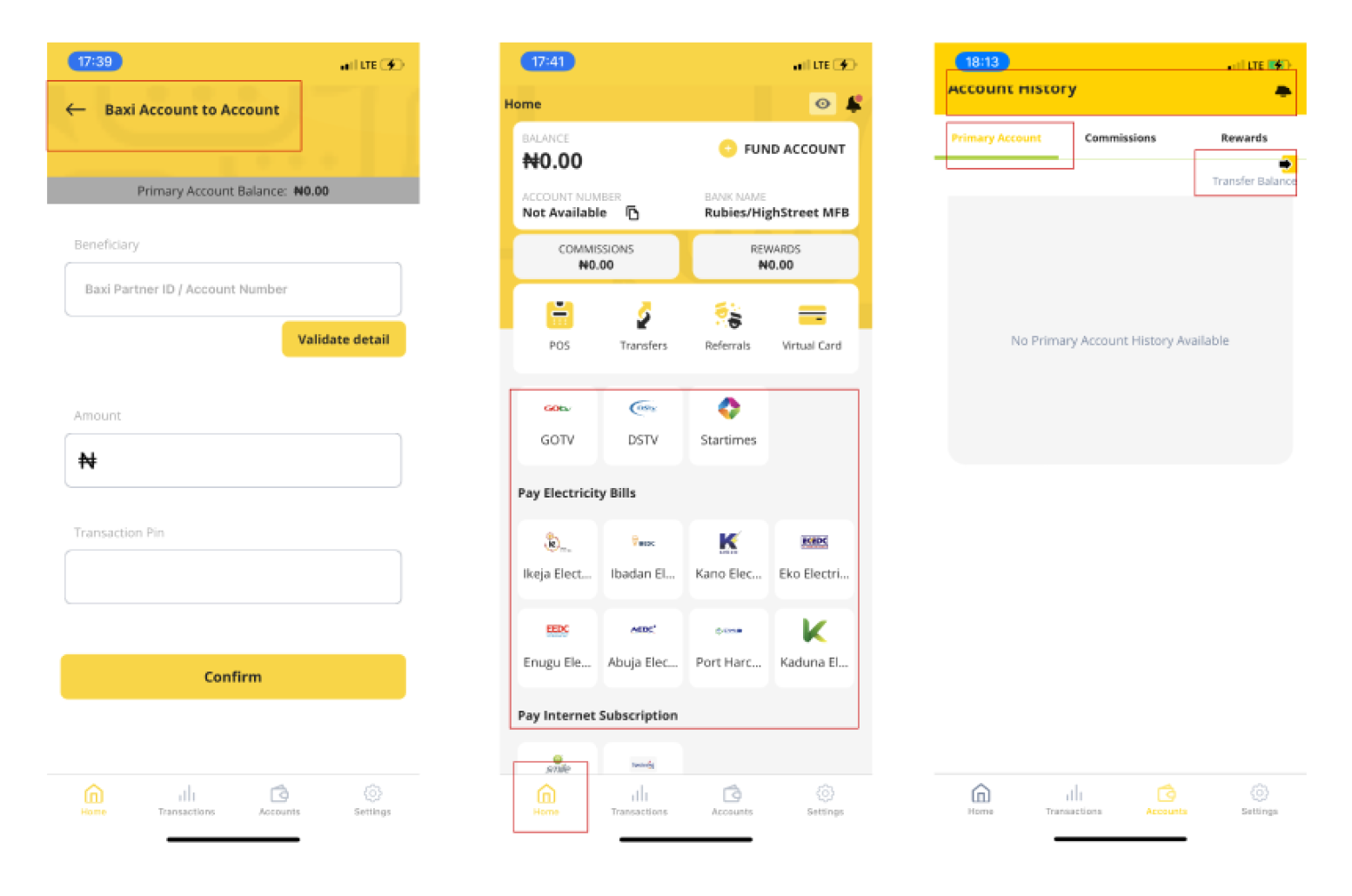
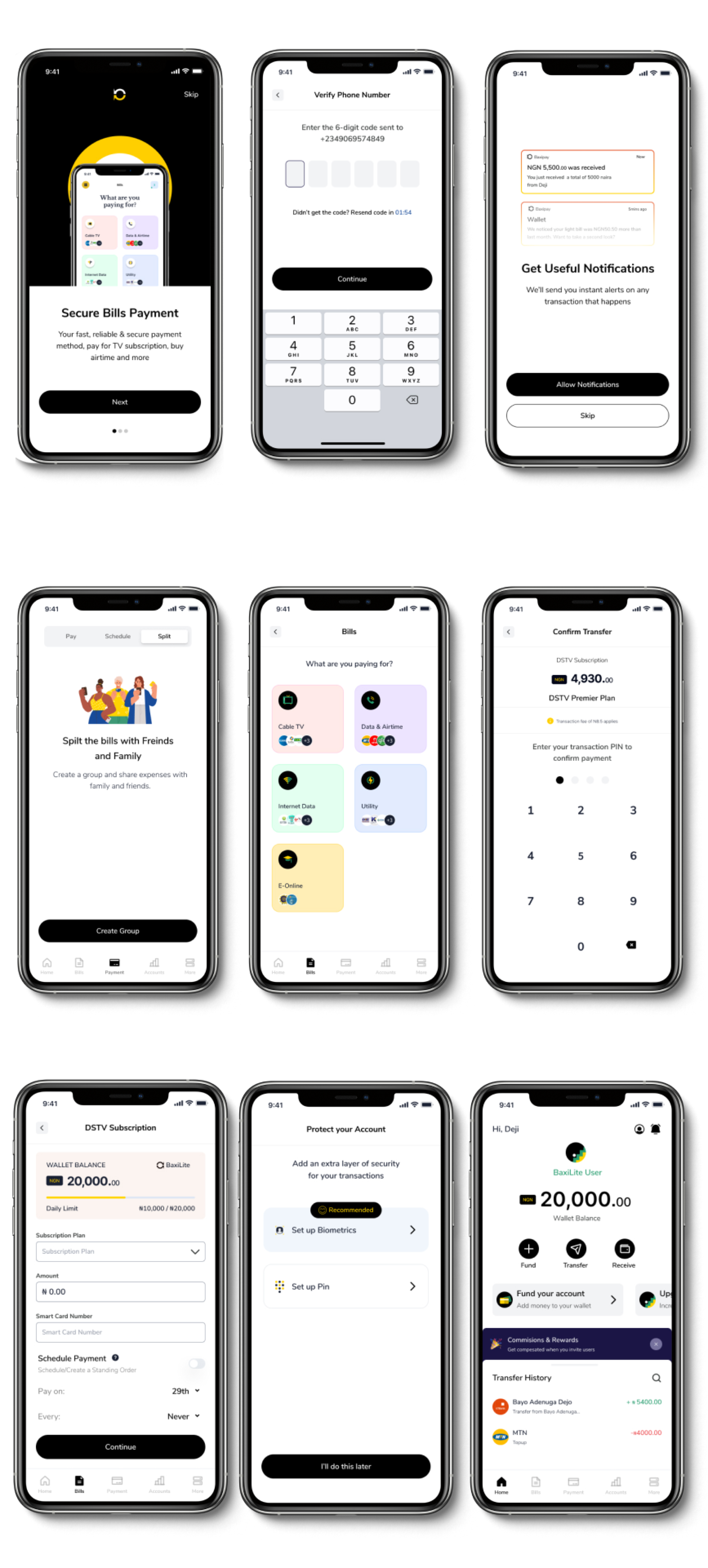
What can baxiPay do ?
Here is a glimpse at some of the key features of the app
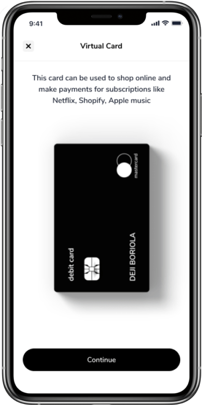
Virtual Card Split : Shop on Asos, Amazon, and more with ease. Pay for Netflix, Apple Music & Spotify, and more
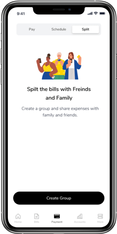
Split Bills : Split bills with flatmates, Colleagues, and Family. We’ll do the Calculations.
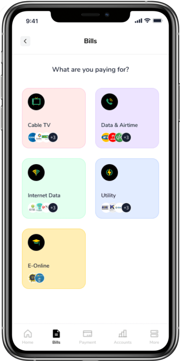
Pay for Bills : No long queues anymore. All of your bills are in one place with no hassle.
Research and Planning
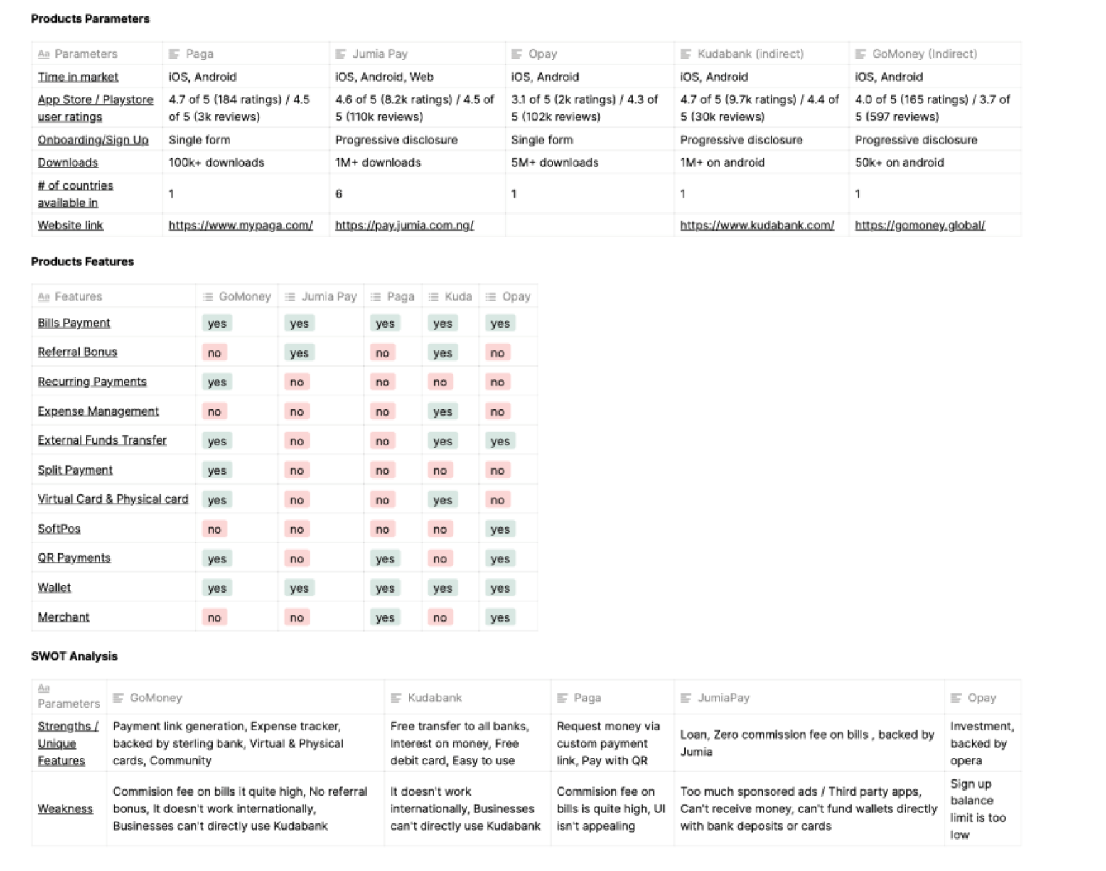
I conducted competitive and market research looking at both direct and indirect competitors to identify current design conventions and prioritize product features as well as find opportunities to stand out and differentiate the product.
Competitive Analysis
I conducted competitive and market research looking at both direct and indirect competitors to identify current design conventions and prioritize product features as well as find opportunities to stand out and differentiate the product.
User Interviews
I created an Interview Guide to facilitate the user interview process that helped find answers to open discovery questions, understanding users' tasks and activities, their opinions and attitude, and talking about problems and pain points.
- 7 Phone interviews
- 3 In-person interviews
- 10 minutes Average length
- “ Signing up was a bit too stressful, especially with the BVN verification”
- “ I love to use it because I can split payments with my flatmates. So we don’t have to fight over house bills”
- “ I’d love to pay and manage all my subscriptions in one place”
- “ Is it free to use ?”
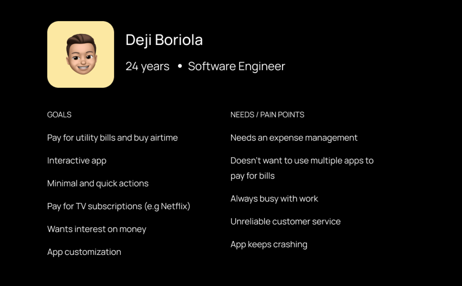
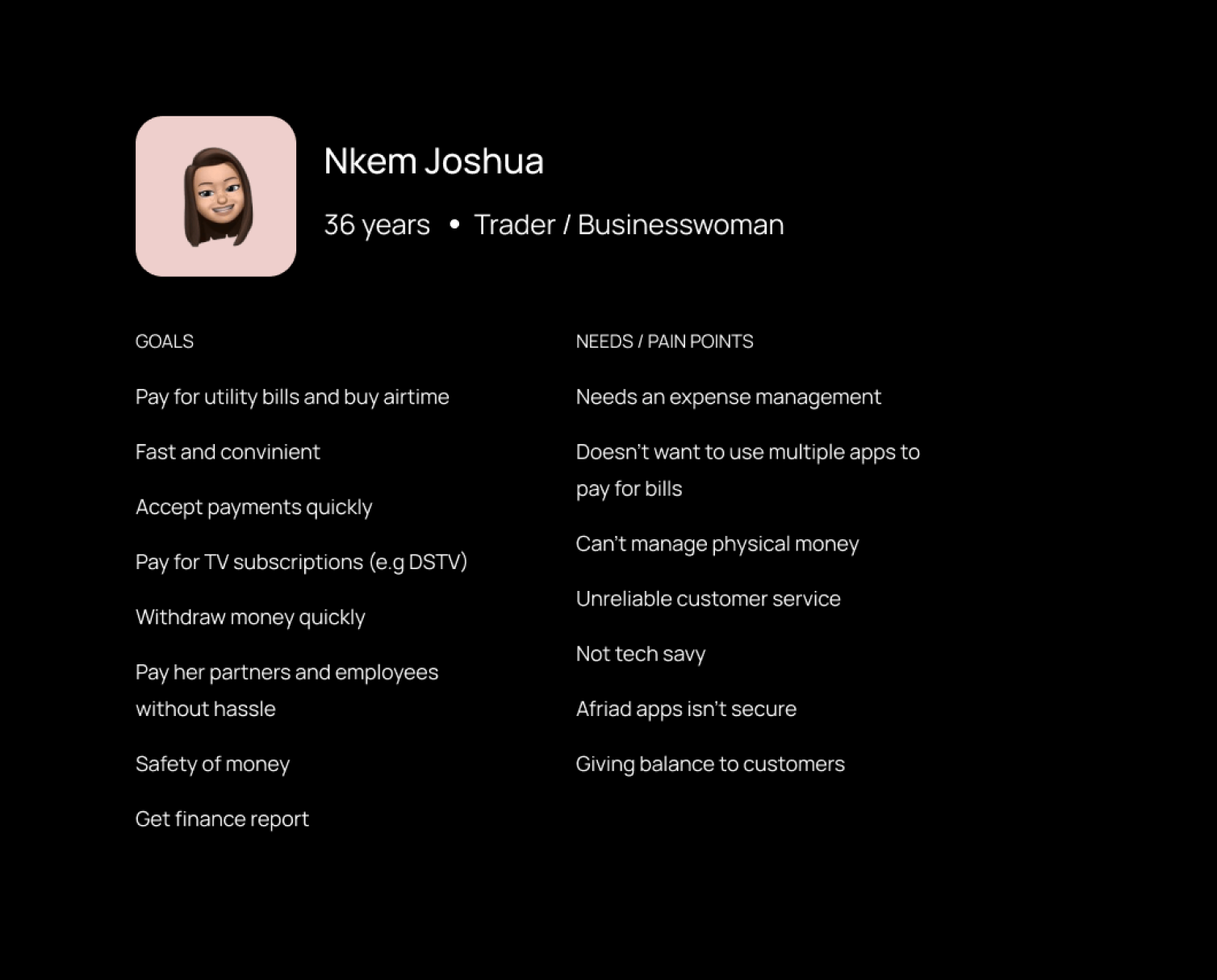
Provisional Personas
To ensure sure that my decisions moving forward in the process are user-centered, I wanted to have a clear understanding of who Baxi users are.
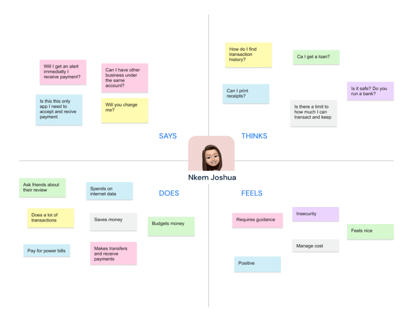
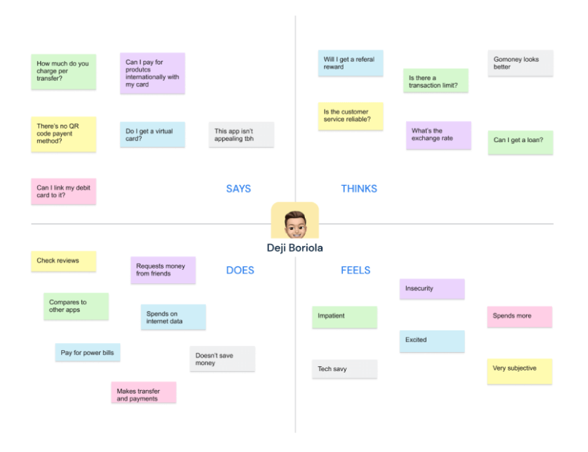
Empathy Mapping
An empathy map allows us sum up our learning from engagement with people. The map provides 4 major areas in which to focus our attention on, thus providing an overview of a person's experience.
Heuristic Evaluation
My end deliverable is a redesigned mobile app, we evaluated the functionality, navigation, and design of the existing Baxipay app.
Key findings from Usability testing
- Users weren’t involved in the user experience design process for the current app. The app lacks the personalization
- The app wasn't simple to navigate
- App language wasn’t consistent
- The app needed new features to actually compete
- App UI wasn’t appealing to use
- Users were already using their bank apps to pay for bills directly
- Error management was poorly communicated
- Users feedback were poorly communicated as well
- Users wanted all types of digital payments to complement their lifestyle.
- Users wanted enhanced security features
- Users wanted virtual card features to pay for things online
- Users would appreciate getting compensated on referrals
Definition
Before making further decisions with sketching and building out wireframes, I wanted to figure out what product features mattered the most and what the journey would look like for customers trying to accomplish specific tasks.
Brainstorming
Having gathered tangible information on users, thanks to all the users that participated in both our primary and secondary research. I and the product manager had a brainstorming session with the aim to have a clear project vision and identify necessary features to include. We also implored a decision matrix as well to drive some decisions.
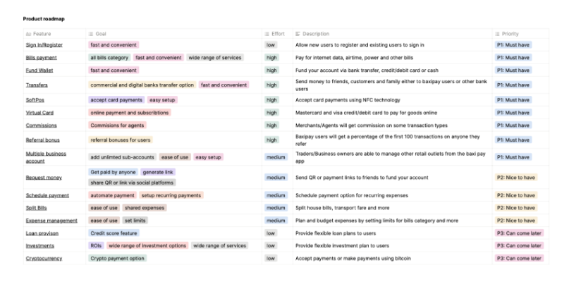
Product Roadmap
Putting into consideration the user and business goals. We created a product roadmap that included existing features, new features, nice to have features as well.
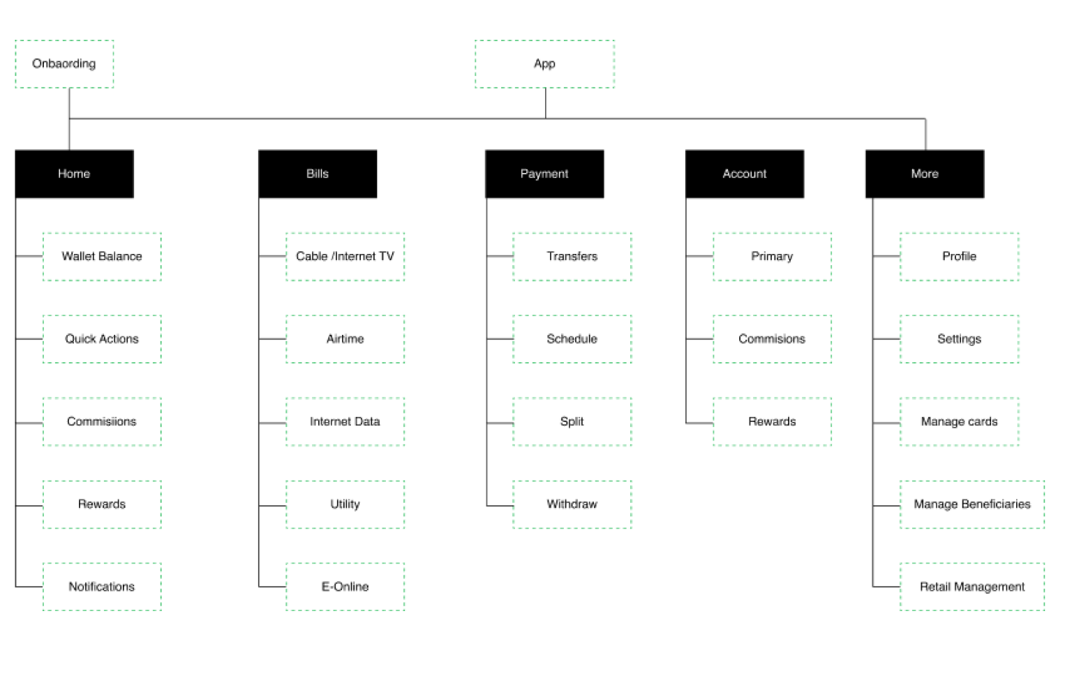
Information Architecture (Site map)
To show the hierarchy and navigation structure of the app I decided to design an information architecture that’ll show how users may transition from one task to another.
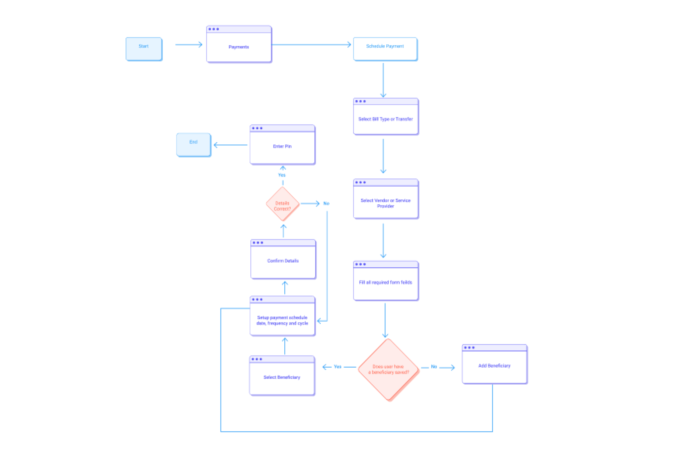
User Flow
To walk in the user's shoes, I created a user flow for each application section to think through how users might navigate the application. Below is an example of the Schedule payment flow.
Design
Having organized all my research and defined my solution, it was time to get the work done. From lo-fi wireframe sketches, mid-fi wireframes, and hi-fi designs.
Lo-fi Wireframe Sketches: I sketched out wireframes to visualize my ideas and flows. I always love to sketch my ideas on paper. It then starts to make more sense.
Mid-fi Wireframes: It was time to digitize my sketches. I created the mid-fi prototype using Figma.
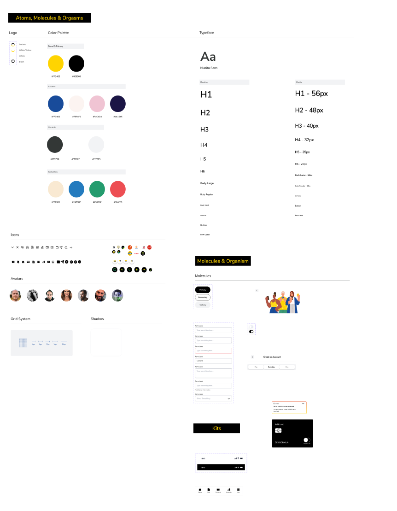
Hi-fi Designs: After I was done with the sketches and mid-fi wireframe, I started to work on my style guide as well as creating a mood board and finally firing up the designs.
A/B Test
We conducted some A/B tests with users and we were able to get some insights that helped with some design decisions.
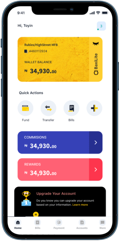
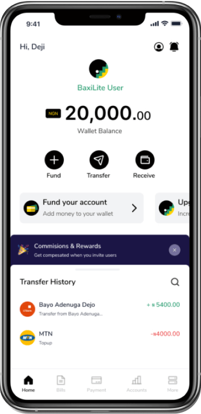
Home page design before our usability session.
Home page design after our usability session.
What did I learn
This project was a lot of fun to work on. learned a lot while research mobile payments. I’ve been able to gain solid ground on payments and how it works. Also, I’ve learned that the best way to build a product is by observing and listening to users and as well using the right tools.The App is currently in the beta phase. We’ve been doing a lot of analytics and still testing. I’ll be conducting more rounds of usability testing and iterate based on the patterns from users and do a proper dev-hands-off.We’ll also be adding more features in the future. Also from most of our usability and focus group testing have been promising and we are highly expectant of:
- Increased Engagement
- Increase in organic traffic
- Higher retention